
Welcome to a recap of my recent talk at SE Factory X BDD Tech Talk Week, where we explored the symbiotic relationship between technology and design. My session delved into the vital role of UI/UX in software development, breaking down complex concepts through everyday analogies and practical tools. Join me as we revisit the insights and strategies that I shared, aiming to empower developers in crafting intuitive and aesthetically pleasing digital products.
Chapter 1. The shampoo bottles paradigm
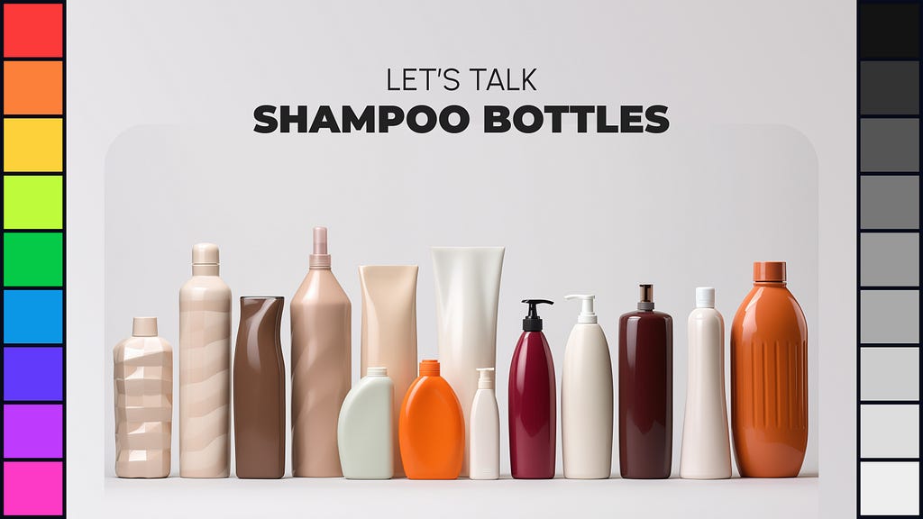
When you're standing in the aisle of a supermarket, poised to choose a shampoo, what guides your decision? It's often a blend of visual appeal (the UI, or User Interface) and anticipated experience (the UX, or User Experience). Let me explain how a shampoo bottle can teach us about the essence of UI/UX.
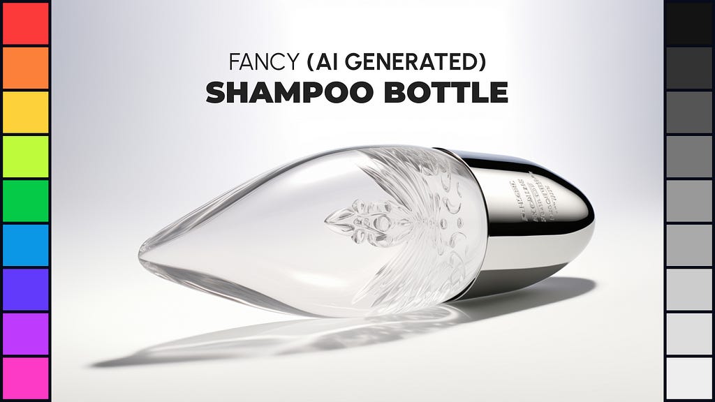
In my talk, I introduced a fancifully designed shampoo bottle: glass body, metal cap, a look straight out of a luxury catalog. But it failed the UX test, it wouldn't stand upright, it was slippery when wet, and if dropped, it would shatter. It's a perfect analogy for software that might look fantastic but fails to consider the user's environment and needs. A beautiful app that crashes under load or a website that's a maze to navigate are the digital equivalents of that glass shampoo bottle.
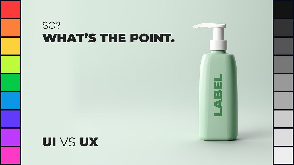
UI. The aesthetic and functional design
The UI of a shampoo bottle can be broken down into several elements. The shape of the bottle, its label, the color scheme, and the typography used, all these contribute to the visual design. But UI isn't just about looks, it's also about function. How does the bottle fit in your hand? Is the cap easy to open, even with wet hands? This is where the design meets practicality.
UX. The user's journey
Now, let's talk about the UX of that same bottle. It extends beyond the first impression to include the entire lifecycle of interaction. Will the bottle slip from your grip in the shower? Can you get every last drop out without frustration? And when you're done, do you feel like rebuying the same brand? That's UX, it's all about how the product fits into your life, satisfying needs and perhaps even delighting you in the process.
Chapter 2. Meet Julien Hosri
In the realm where code meets creativity, I found my calling. As Julien Hosri, with over nine years threading through the complexities of software engineering and the nuances of UI/UX design, I've embraced the dualities of my role to become what the industry fondly dubs a UX unicorn. Now, as the creative managing partner at maxiphy, my daily canvas stretches from the precision of code to the fluidity of user interfaces, embodying the belief that great software sings not just through its functionality but its form.

This chapter of my journey is about sharing that mission, to illustrate how the art of UI/UX can elevate a developer's work from functional to phenomenal. It's a testament to the power of integrated thinking, where the logic of code and the empathy of design are no longer siloed but are parts of a cohesive, user-centered narrative.
Chapter 3. The struggles of a developer
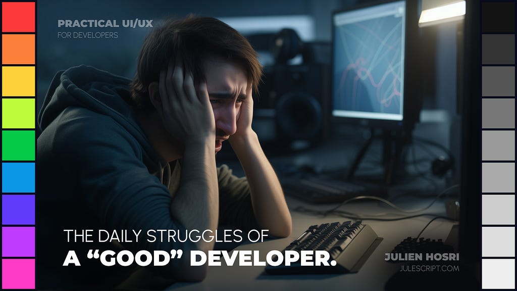
The UI/UX learning curve
Imagine a scenario where you, as a full-stack developer, are handed a project. Your proficiency in coding stands you in good stead, but soon, you find yourself mired in a quagmire of design decisions, tweaking button colors, adjusting text sizes, all at the request of stakeholders. This constant back-and-forth not only distracts from the core development but also elongates the project timeline unnecessarily.
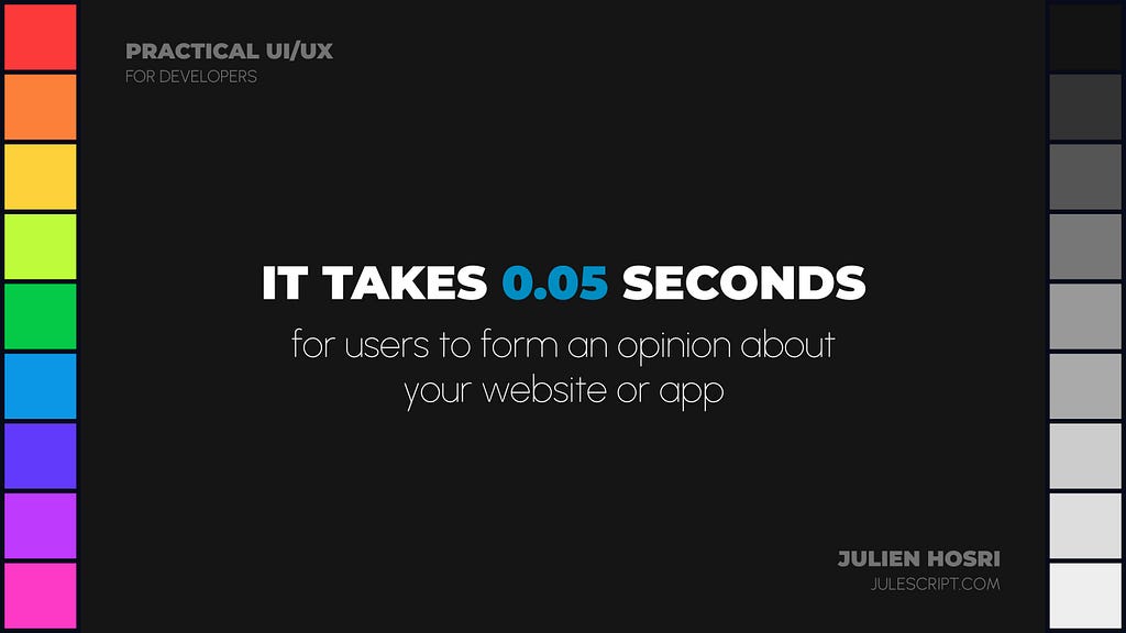
The critical 0.05 seconds
"Users take a mere 0.05 seconds to form an opinion about your website or app." This snap judgment means that regardless of the sophistication of your back-end work, the initial visual appeal plays a pivotal role. The hero section of your website is particularly crucial. A lackluster design in this area can lead to immediate rejection, long before users engage with the content or functionality.
Chapter 4. Bridging the gap between development and UI/UX
So, how can you, as a developer, become more proficient in UI/UX? The key lies in understanding and applying certain principles.
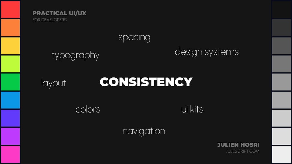
Consistency in design
Consistency is vital in design. It's crucial in elements like typography, color schemes, spacing, and layouts. Inconsistent design elements are quickly noticed and can disrupt the user experience. Adopting mature design systems, such as Material Design or Apple's Human Interface Guidelines, provides a framework for creating cohesive and intuitive interfaces.
Typography and color psychology
Typography and color are more than just aesthetic choices, they guide user experience. Type scales enhance readability and create a visual hierarchy, while color choices can evoke the desired emotional response. Tools like Coolors.co can assist in selecting harmonious color palettes.
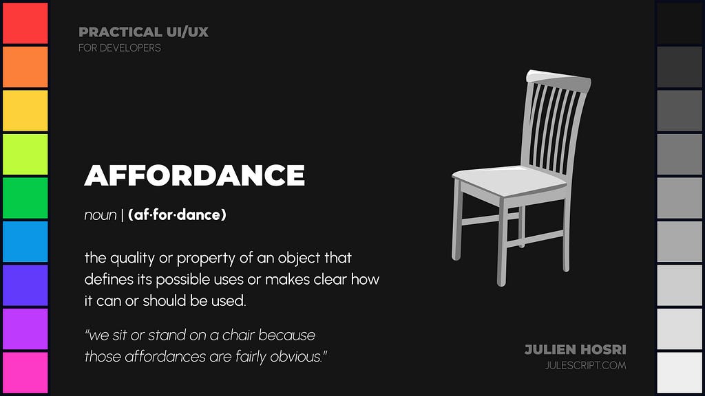
The principle of affordance
Affordance in UI design ensures that the purpose of an element is obvious. For instance, a button should look clickable, and a slider should intuitively indicate adjustability. Effective affordance reduces user confusion and enhances the overall user experience. Running an honest affordance check across a product is usually the first pass I make on a UX audit engagement.
I've written a deeper follow-up on this specific idea. If affordance interests you, read Affordance in software design next, it unpacks the three quiet ways most products break the contract and the five checks I run on every surface I audit.
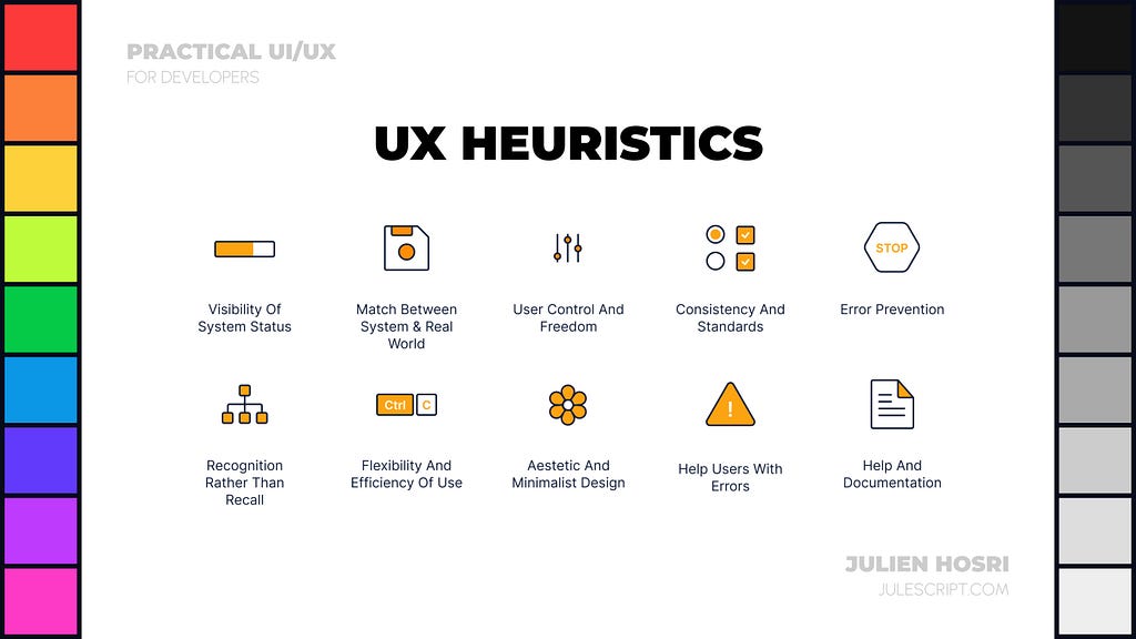
Applying UX heuristics
Familiarize yourself with Nielsen's 10 UX heuristics. These principles are essential for creating user-friendly interfaces that are easy to navigate and understand.
Prioritizing accessibility
Reflect on cases like Guillermo Robles vs. Domino's to comprehend the importance of accessibility. Ensuring your designs comply with WCAG guidelines is both a legal and ethical consideration.
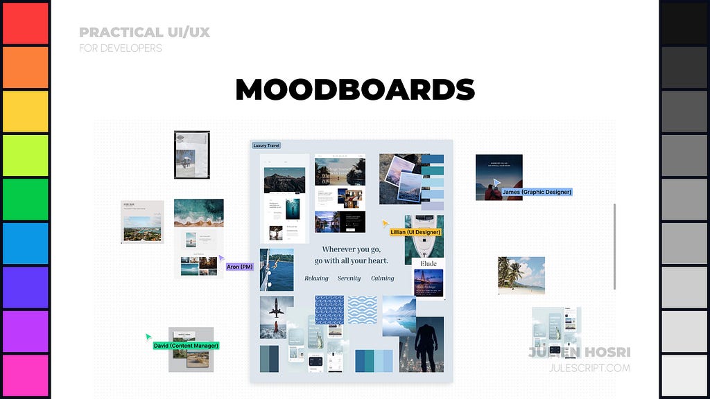
Seeking design inspiration
Inspiration is a key component in UI/UX design. Use platforms like Behance for ideas and creativity. Remember, "good artists copy, great artists steal", it's about adapting inspirations to fit your unique context.
Chapter 5. Essential UI/UX tools for developers
To aid your journey in integrating UI/UX into your development workflow, here's a list of tools that I highly recommend.
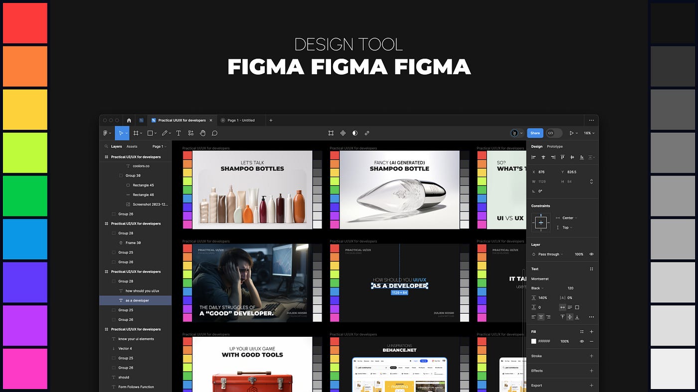
1. Figma and FigJam
Ideal for interface design and ideation, Figma has been instrumental in my design processes, including the creation of this presentation. figma.com
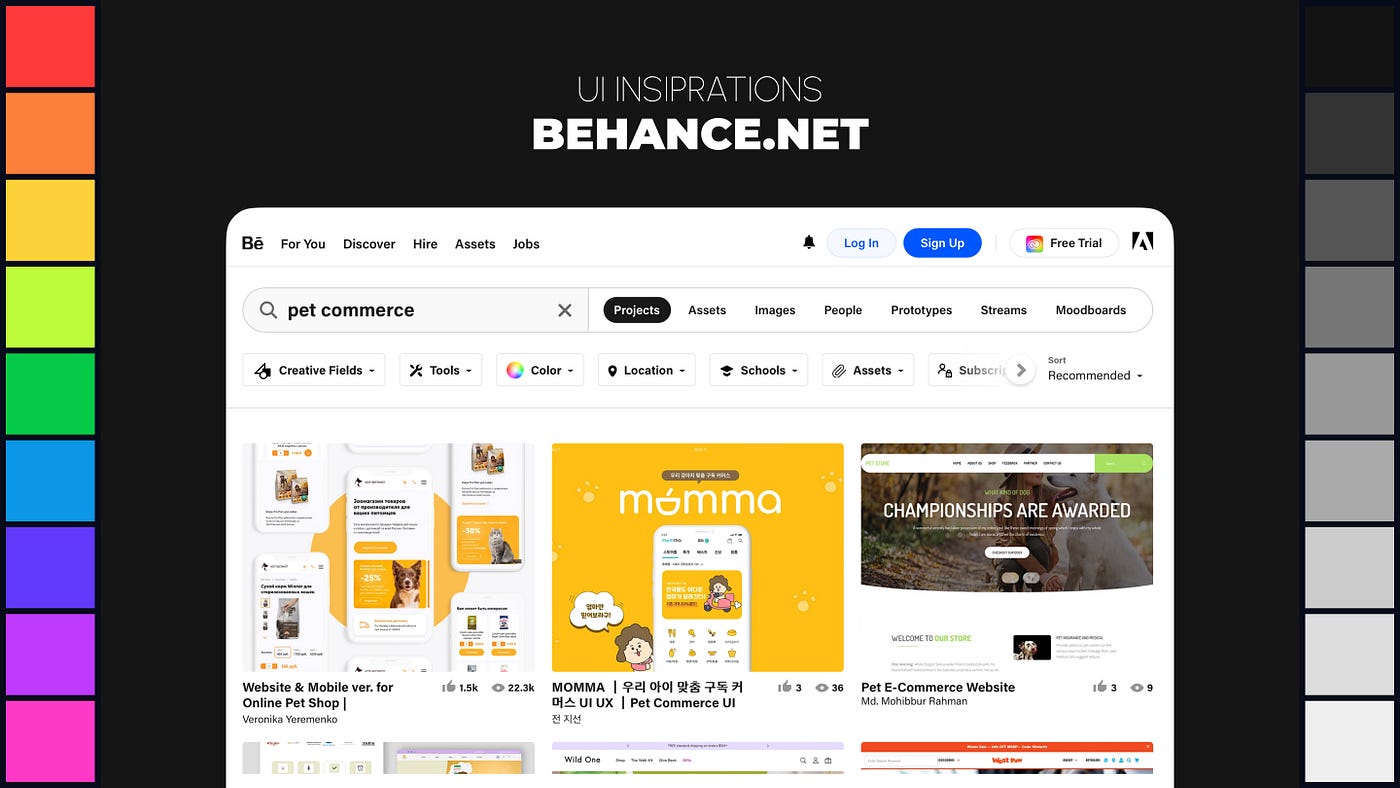
2. Behance
A great source for design inspiration and creative ideas. behance.net
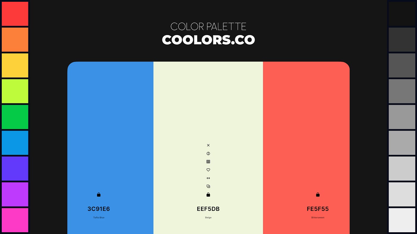
3. Coolors.co
Simplifies the process of creating color palettes, aiding in consistent and effective color usage. coolors.co
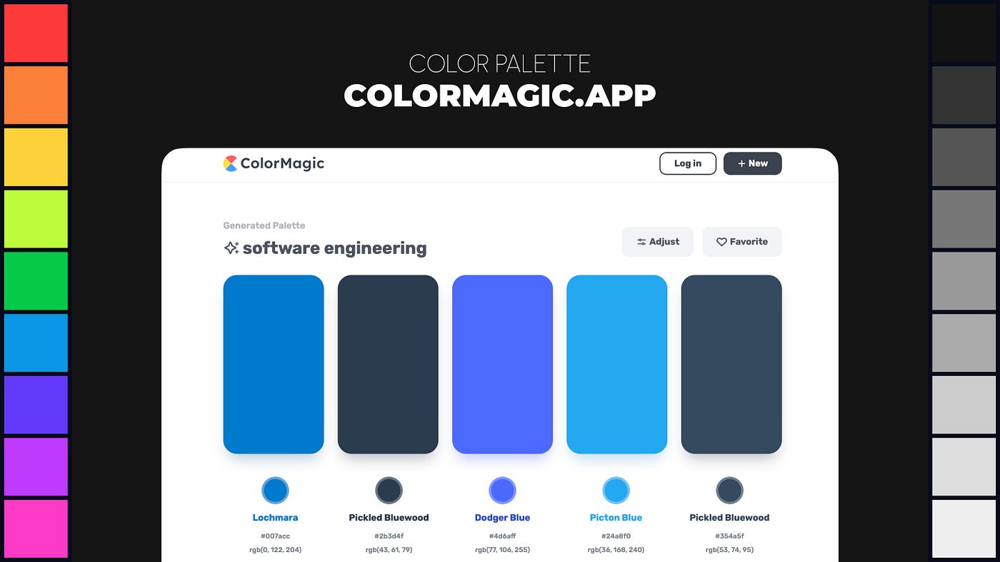
4. Color Magic App
An AI-powered tool for generating color palettes based on keywords, facilitating creative and cohesive color schemes. colormagic.app
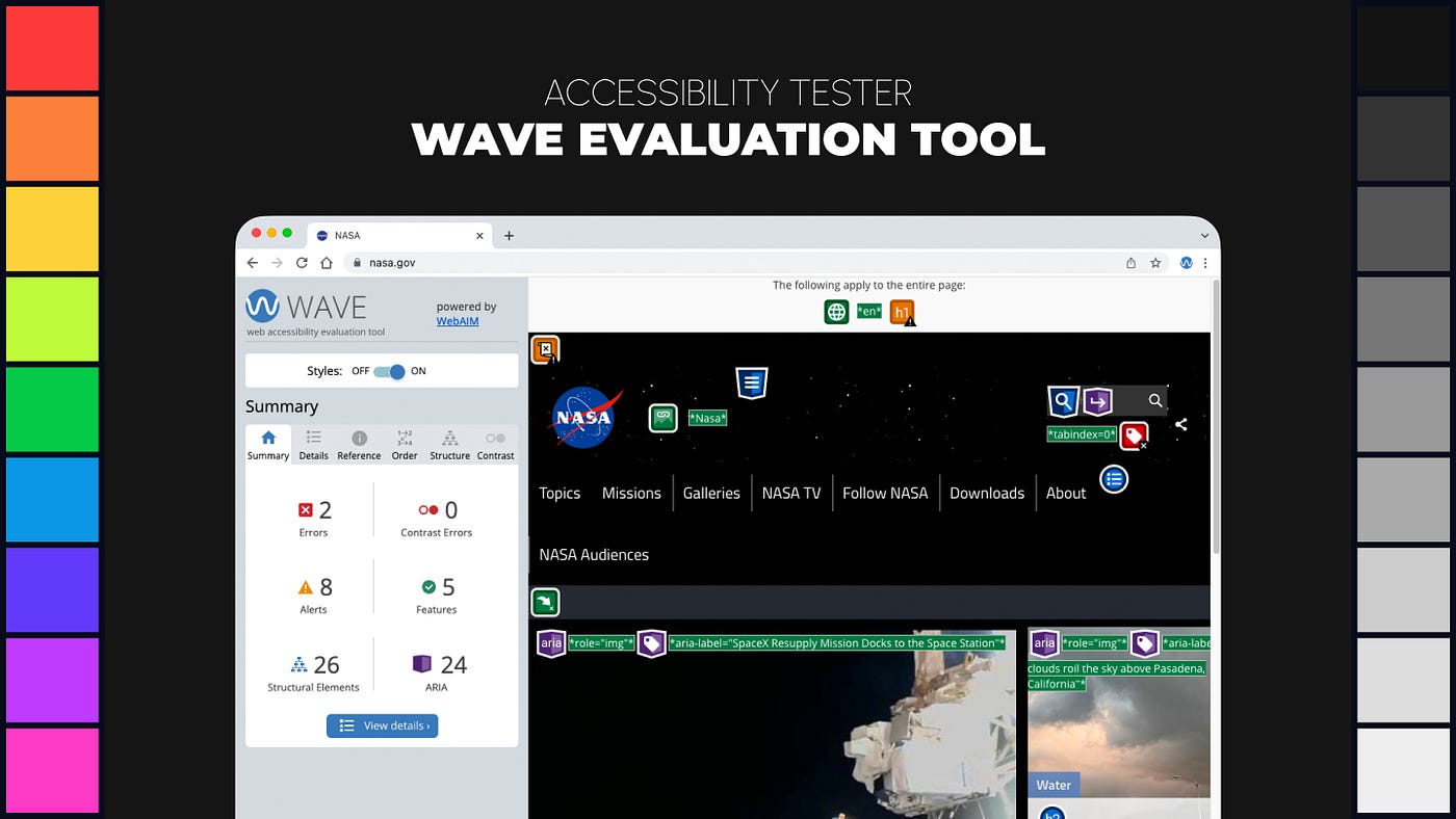
5. WAVE Evaluation Tool
This Chrome extension is crucial for assessing the accessibility of your website, ensuring compliance with web accessibility standards. Chrome web store →
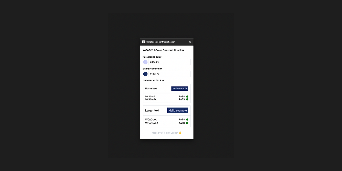
6. WCAG Accessibility Tool (Figma plugin)
Integrates accessibility checks directly into your Figma design workflow. Figma community →
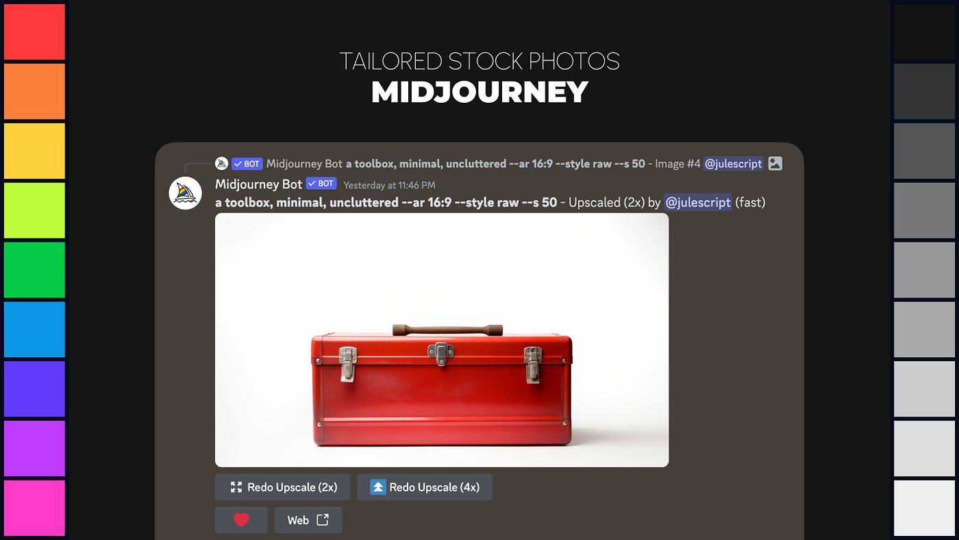
7. Midjourney
Useful for generating high-quality, copyright-free images for your designs. midjourney.com
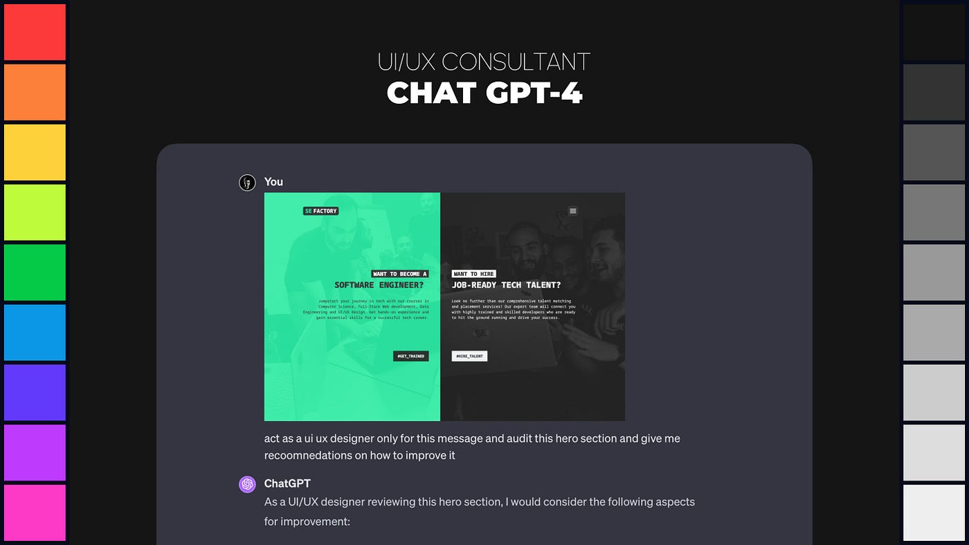
8. OpenAI ChatGPT-4
A versatile tool that can act as a UI/UX consultant, providing feedback and suggestions on your designs. chat.openai.com
9. Uxcel
An excellent resource for learning and refining your UX skills. uxcel.com

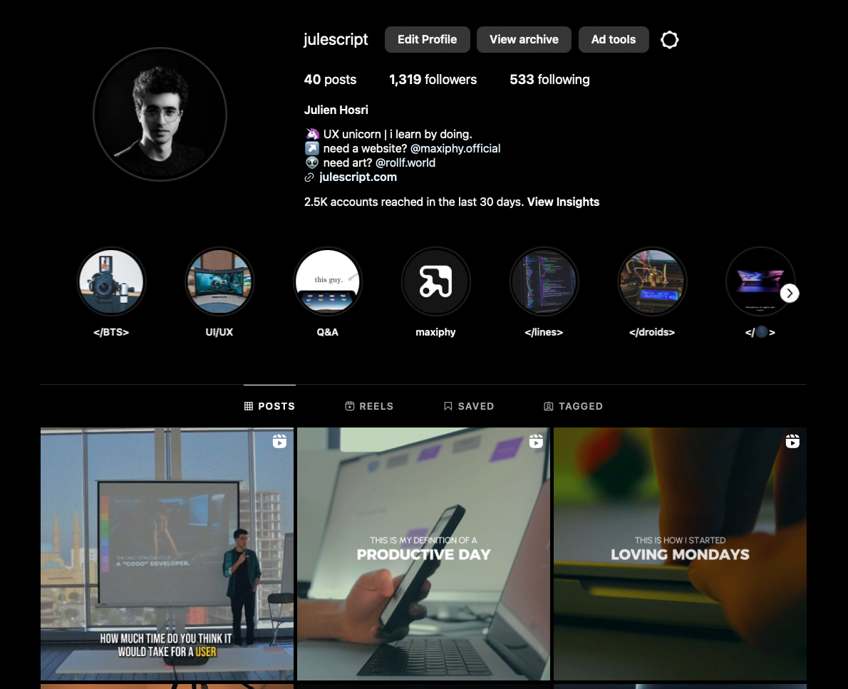
10. My Instagram page
Follow for ongoing tips, tutorials, and news on upcoming workshops and events in the UI/UX space. instagram.com/julescript
Conclusion
To all my fellow developers seeking to elevate their craft and become truly indispensable in this ever-evolving tech landscape. Mastering UI/UX is not just an additional skill, it's a crucial component of your professional arsenal. In the intricate dance of building software that not only functions seamlessly but also resonates with users on an intuitive level, the knowledge of UI/UX becomes your most valuable partner.
I urge you, don't just settle for being good enough. Strive to be great. Take the time to learn and integrate UI/UX principles into your workflow. This isn't merely about adding a superficial layer of aesthetics to your projects, it's about deeply understanding user needs and crafting experiences that are not just usable but delightful.
Keep pushing boundaries, keep innovating, and remember. The journey to becoming a great developer is continuous, and every step towards UI/UX mastery is a step towards becoming indispensable.
// originally published at medium.com